CHANGING THE RULES OF THE GAME
- Client
- PJ
- Year
- 2024
- Role
- Branding, Visual Identity, Brand Strategy
In a context where personal training still faces skepticism, and where misinformation about the body and physical performance is widespread, PJ | Personal Trainer aims to position himself as a real and professional alternative for those seeking to transform their health and lifestyle in a conscious and sustainable way.
Beyond creating a serious and professional brand, the challenge was to build a distinctive and noticeable identity in a market saturated with empty promises, superficial messaging, and personal brands lacking graphic coherence and visual strategy.

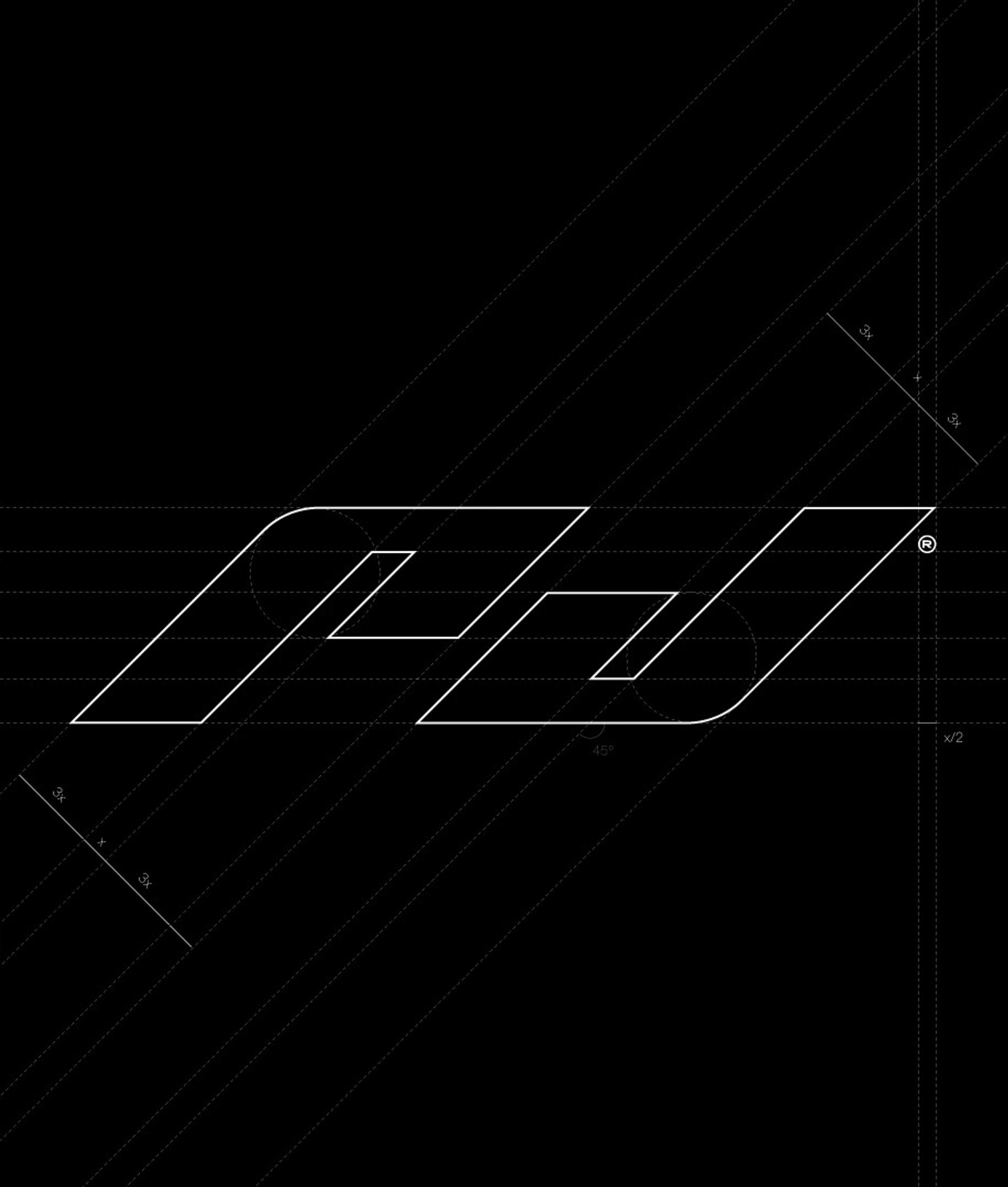
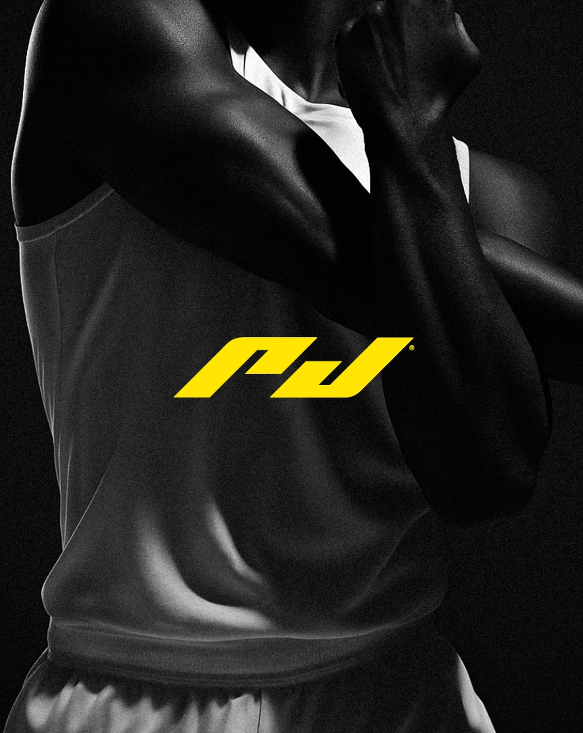
The symbol was built using the initials of the trainer's name, based on 45° closed angles, combining controlled curves with sharp edges.
This geometric structure reflects the dynamism and consistency that define both physical training and the personal evolution of each client. At the same time, the sharp, aggressive nature of the symbol conveys energy and decisiveness, while maintaining clarity and adaptability across all applications.


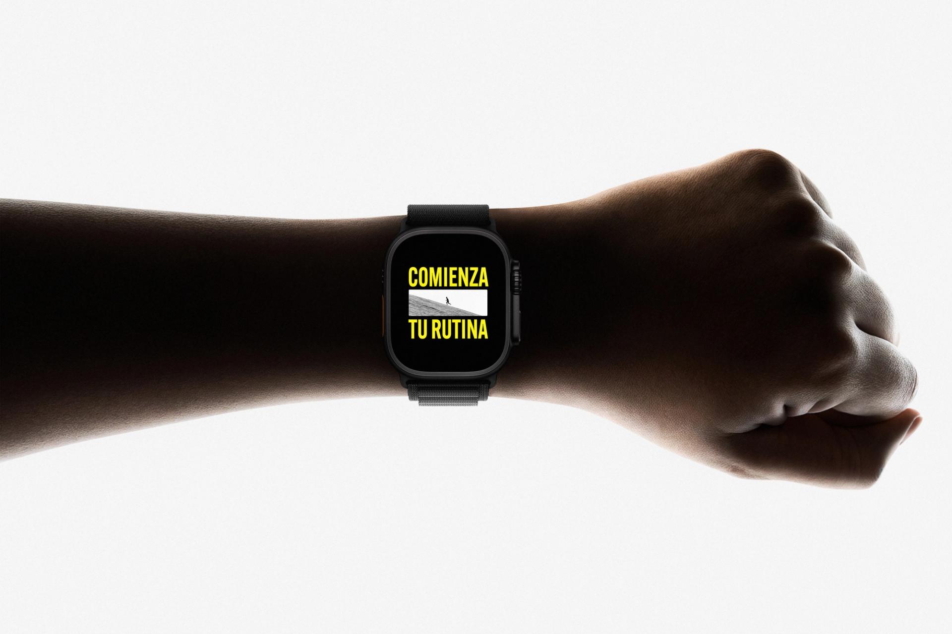
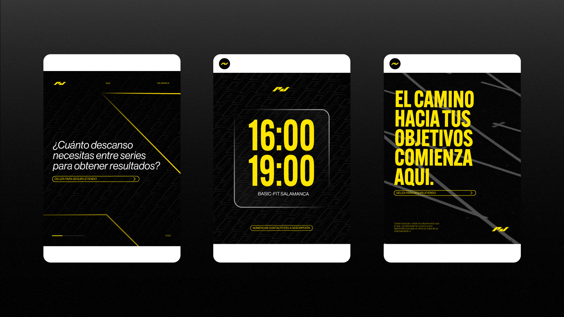
The brand's visual language is built around direct, powerful, and aspirational messaging, reinforcing its strategic positioning at every touchpoint.
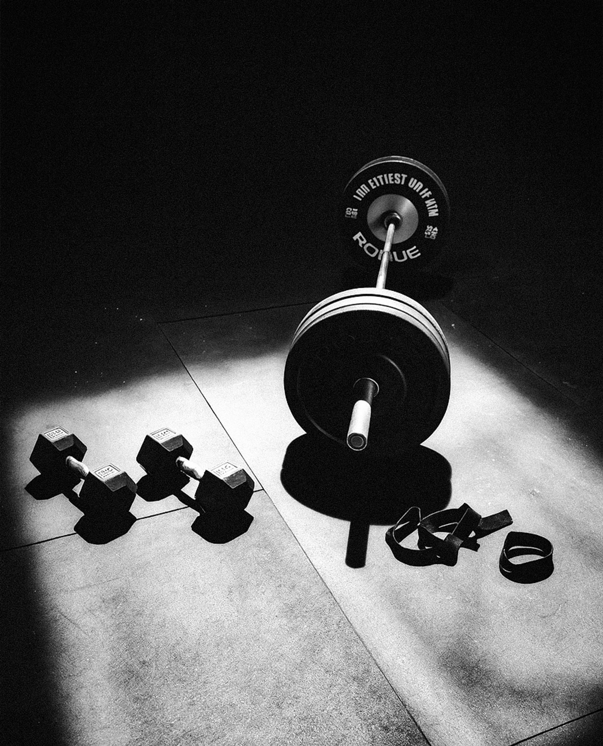
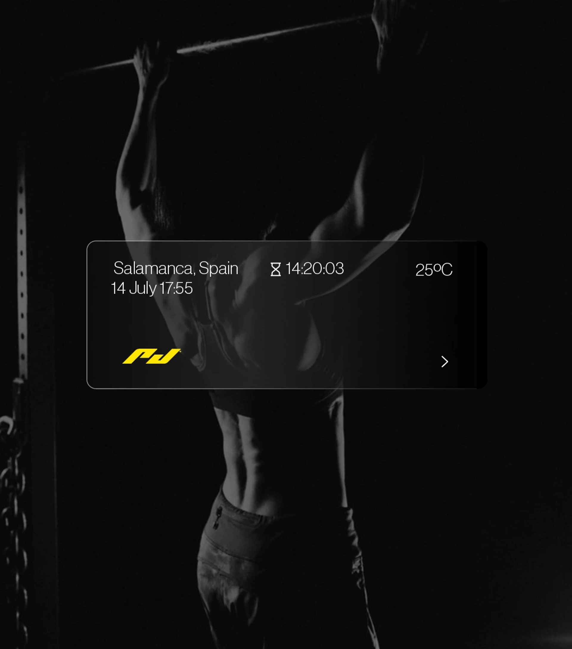
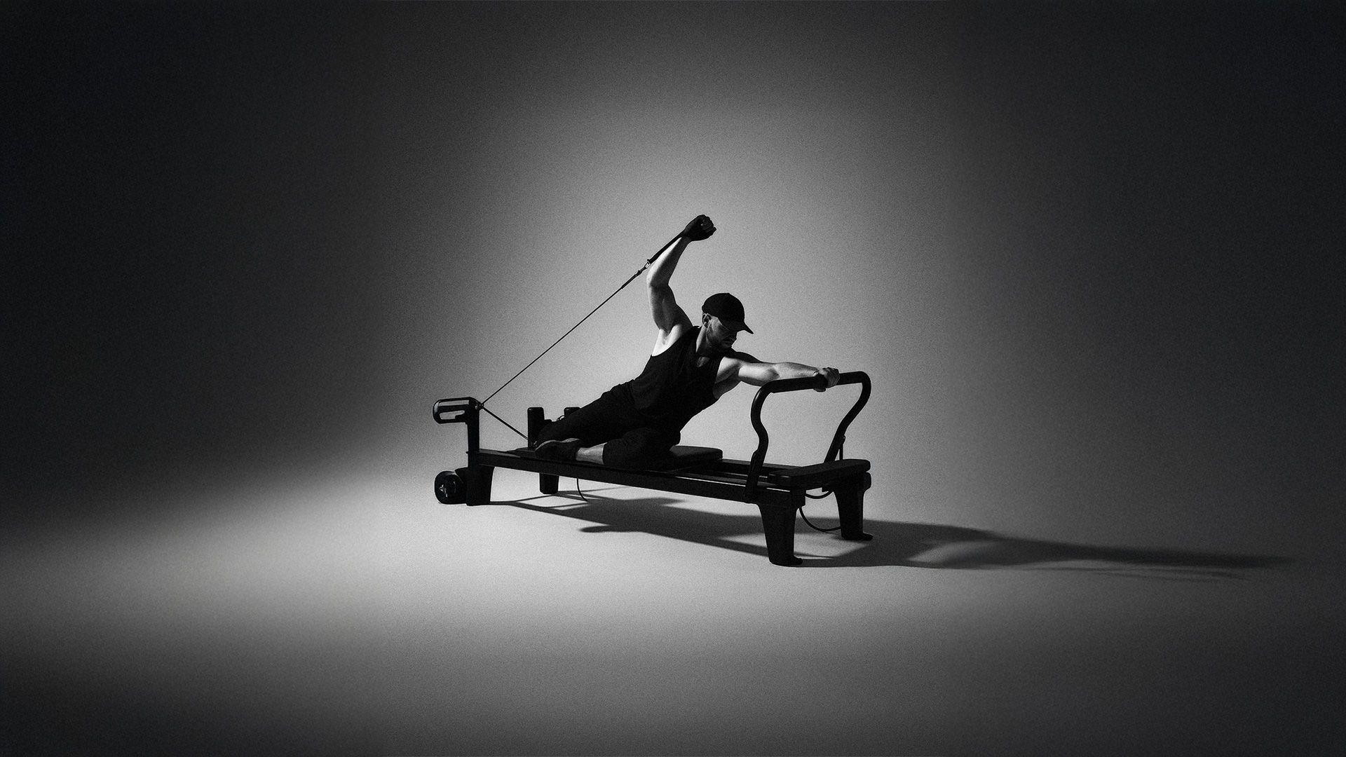
Photography was approached with careful intention, acting as an expressive tool that amplifies the brand's values. It prioritizes the capture of motion, the use of dynamic blurs, and the construction of scenes that communicate effort, focus, and progression — regardless of the athlete's environment.