A NEW SHIELD, THE SAME VALOURS
- Client
- Deportivo Salamanca CF
- Year
- 2024
- Role
- Branding, Visual Identity, Strategy
In 1968, Club Deportivo Trinitarios was founded in Salamanca (Spain), a grassroots football club committed to developing young players through humility, perseverance, and the core values of the sport. Over more than five decades, its growth has been remarkable: from training on dirt fields to owning its own facilities, expanding its structure to become one of the most active and long-standing youth academies at the regional level.
In 2023, following its institutional separation from the school with which it had historically been associated, the club faced a pivotal transformation: a complete identity shift that involved a new name, a new image, and a new ambition.
Ten years after first stepping onto its pitch as a player, the club crossed my path once again — this time from a different perspective, and under a new name: Deportivo Salamanca C.F.
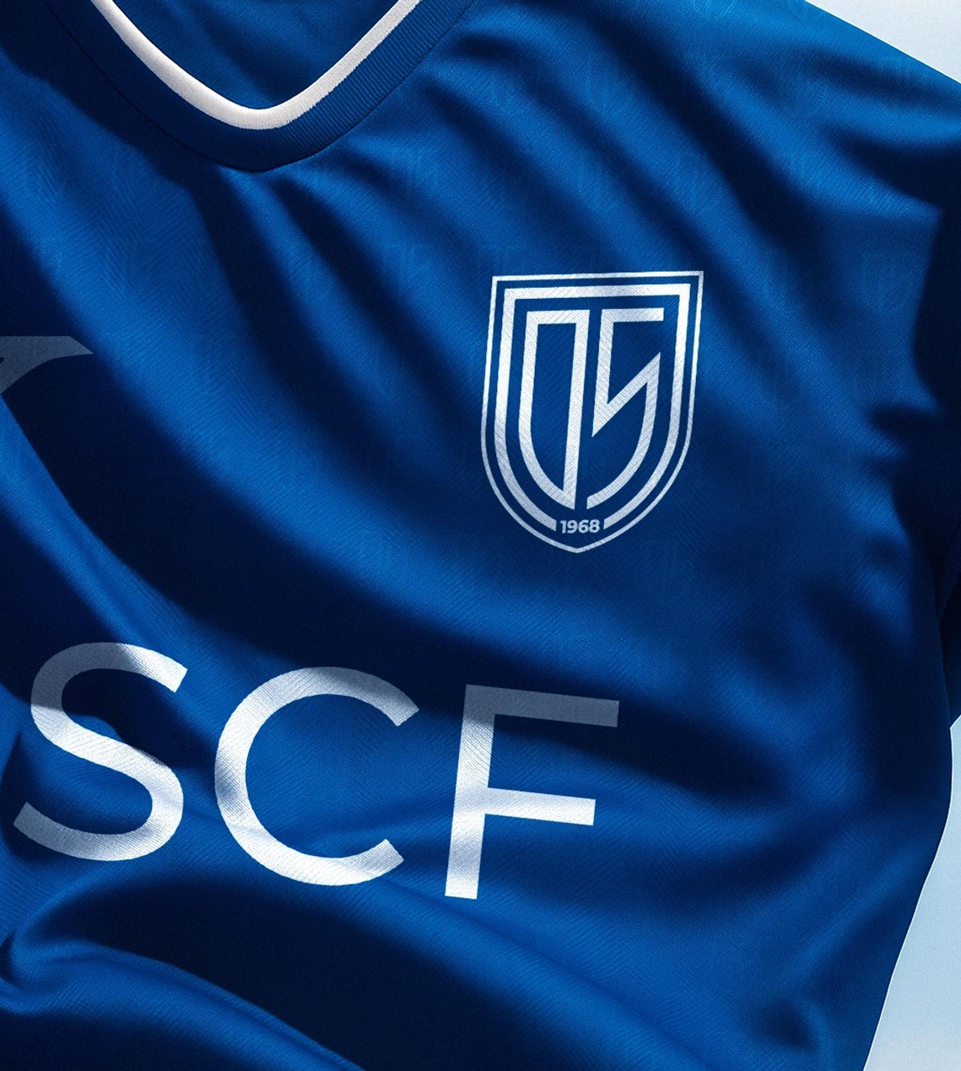



The most significant visual and symbolic challenge was the redesign of the shield, the central element of the club's identity for over 50 years. Beyond a cosmetic update, the goal was to transform a traditional emblem into a coherent and versatile brand system, aligned with the current demands of sport and modern visual communication.
The solution began with a clear principle: to preserve the original shape of the shield as a tribute to the past, while redesigning all of its content from a contemporary perspective. The new design is built on simplicity, elegance, and adaptability, allowing for efficient use across both physical and digital platforms.
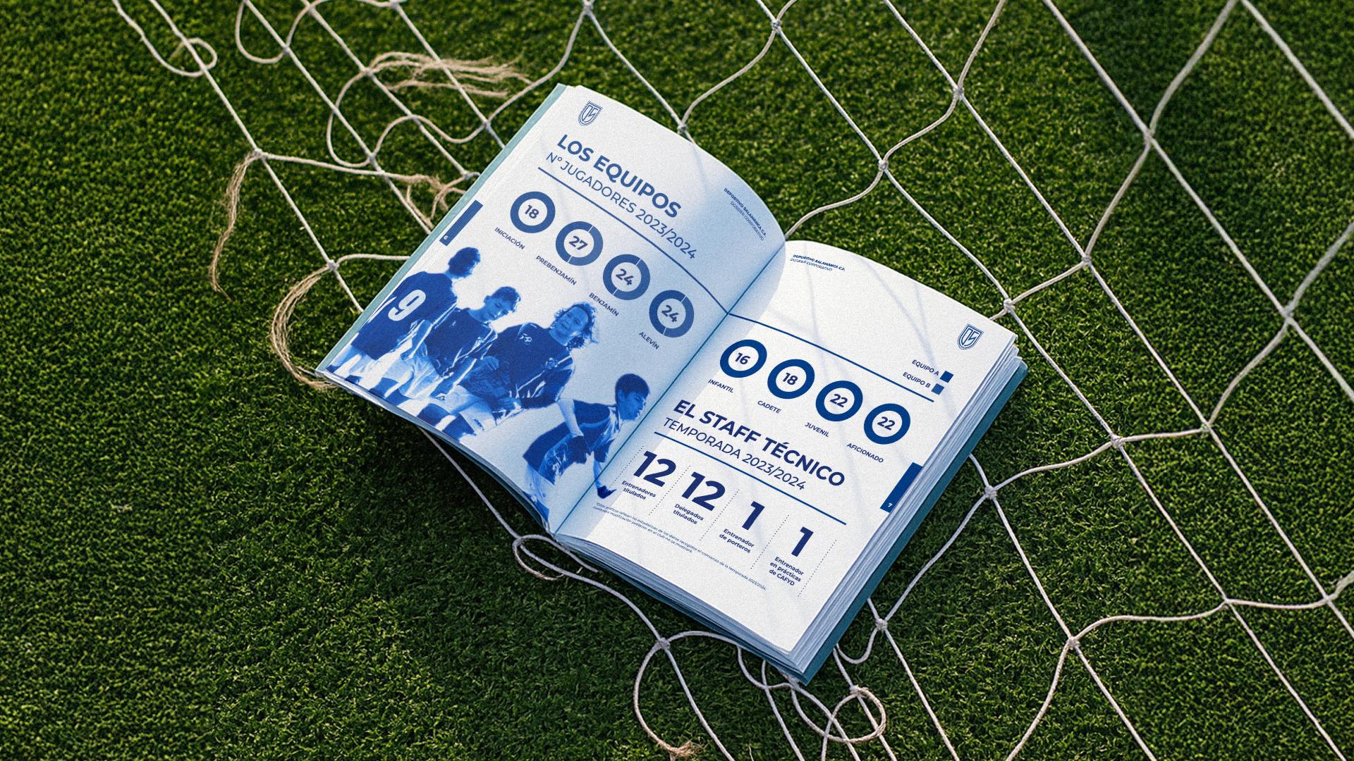

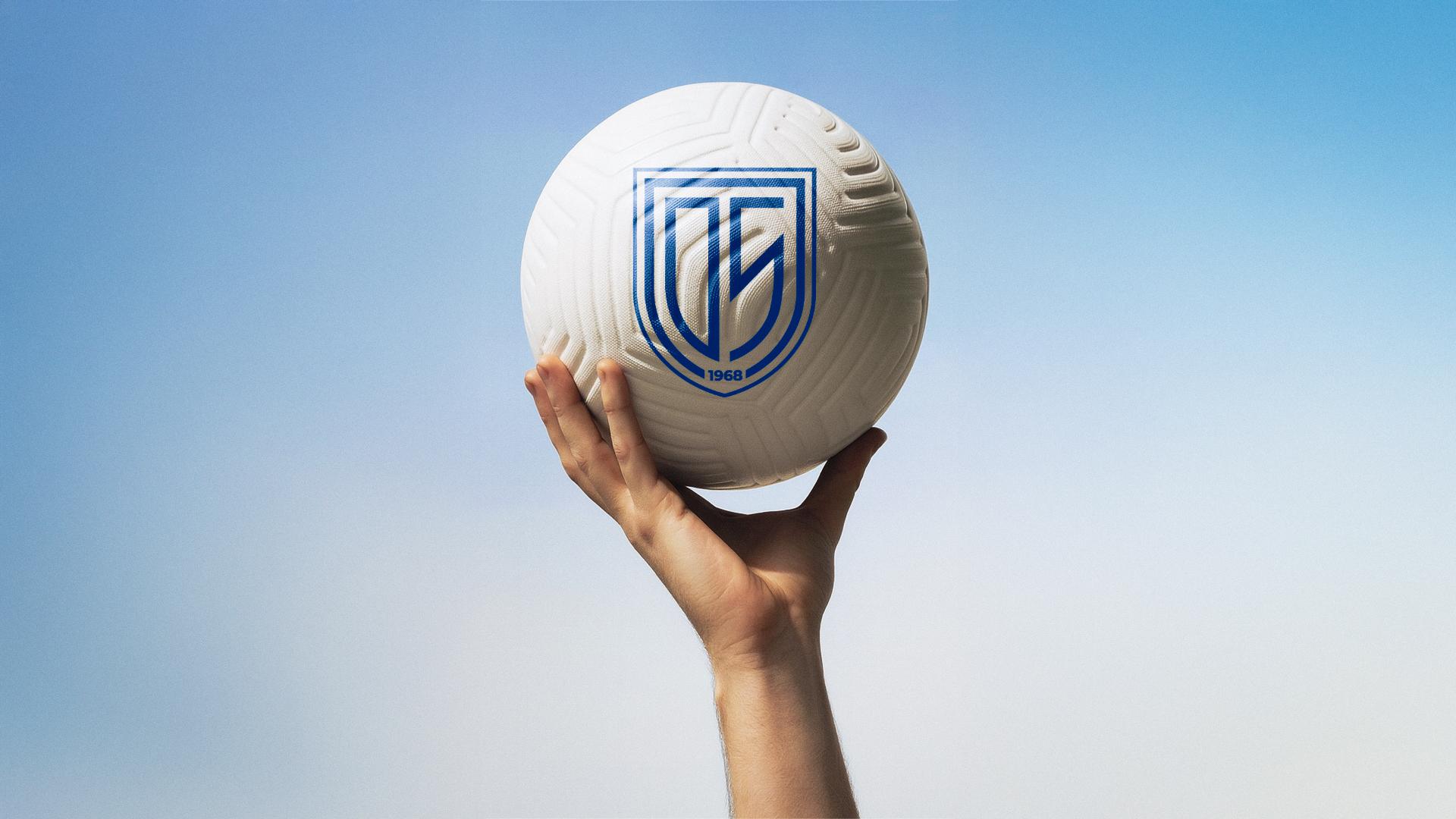
The redesign was not limited to the shield. The project led to the development of a complete visual system, built from the geometric shapes that make up the new emblem.
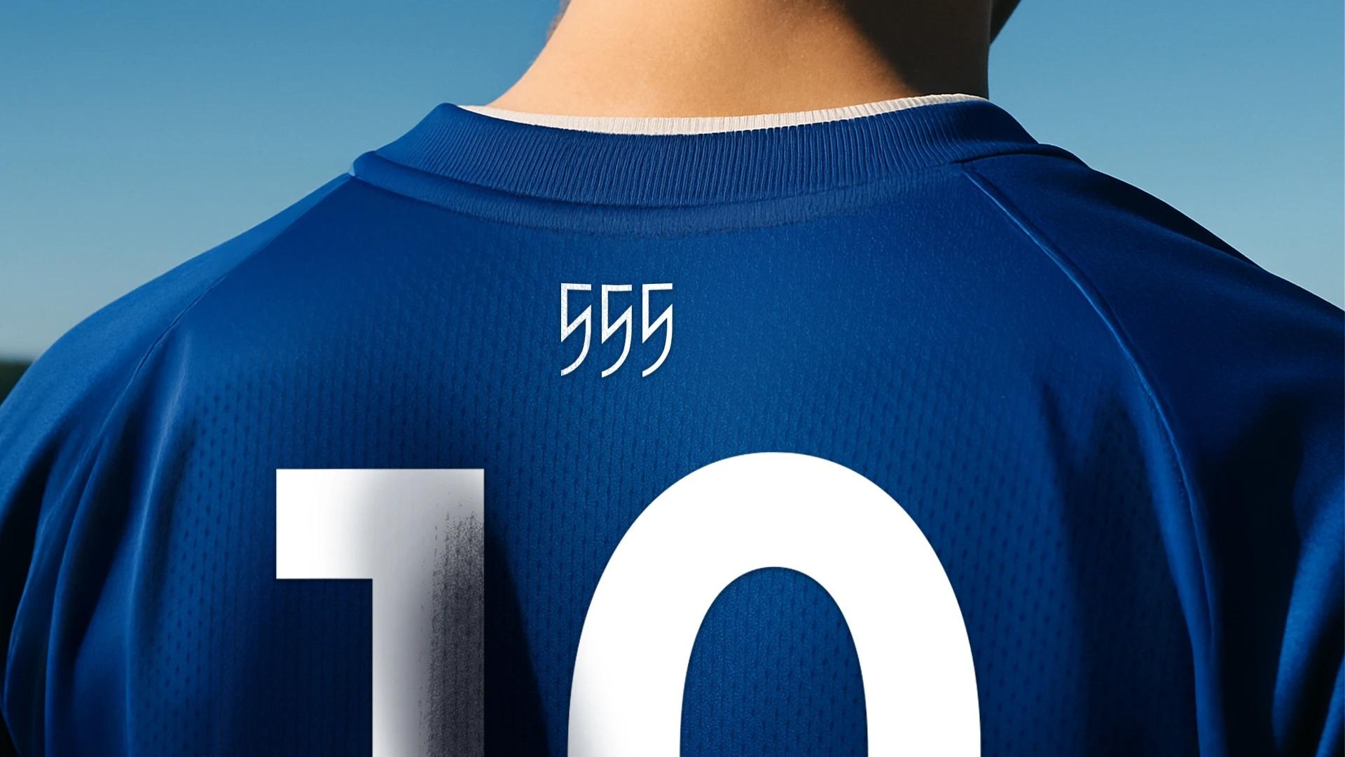
These graphic structures enable the creation of patterns, frames, and complementary visual elements that reinforce the club's identity across all touchpoints, from kits, signage, and publications to institutional materials and social media.

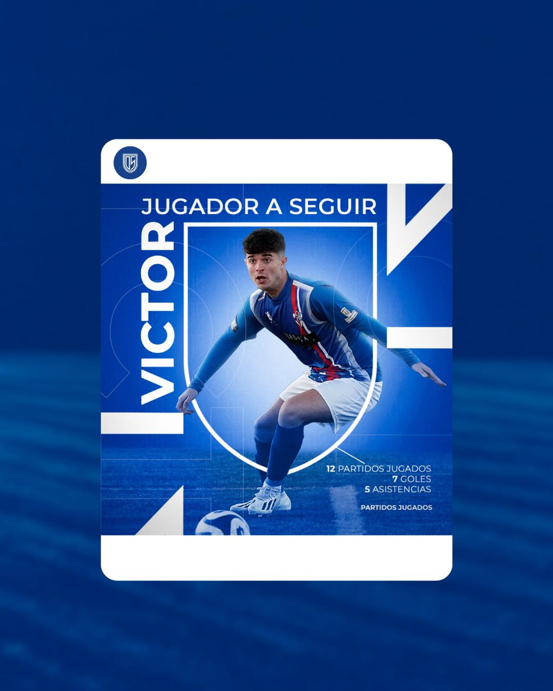
One year after its launch, the new identity has had a direct impact on the club's growth. The number of registered players has increased significantly, new youth categories have been created, and the club has become one of the top choices among younger athletes.
More than a visual update, this project represents a strategic evolution, a brand capable of projecting the club's legacy into the future without losing sight of what makes it unique.